brian hook
Logo & Vehicle Branding Campaign
Overview
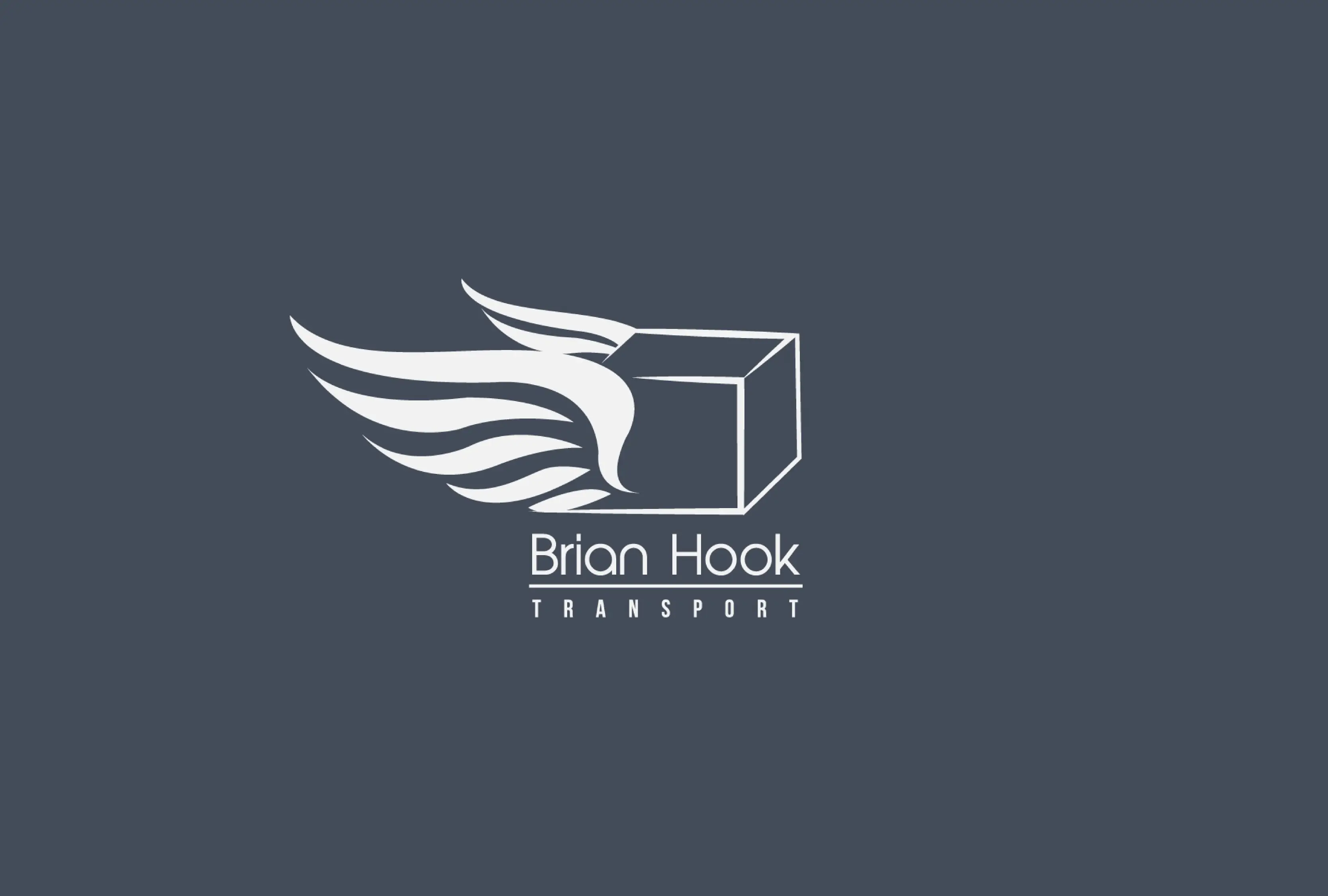
Brian Hook Transport is a logistics and haulage company seeking a refreshed brand presence that would stand out on the road and in communications. The project involved designing a new logo and overarching visual theme specifically developed to be applied on transport vans, signage, and marketing materials that conveys authority, reliability, and visibility.

Design
Process
Challenge
The transport industry is highly competitive, and visual branding must balance professionalism with memorability. For Brian Hook Transport, the objective was to create a serious, trustworthy identity that also catches the eye at highway speeds and on first impressions especially through its implementation on vehicle livery.
Approach
I focused on designing a visual system that would perform equally well in static formats (print and digital) and dynamic environments (moving vehicles).
Logo Design: A bold logotype with structured letterforms, designed to communicate strength and reliability. The proportions and weight were selected to ensure clarity at large scales perfect for vehicle wraps and signage.
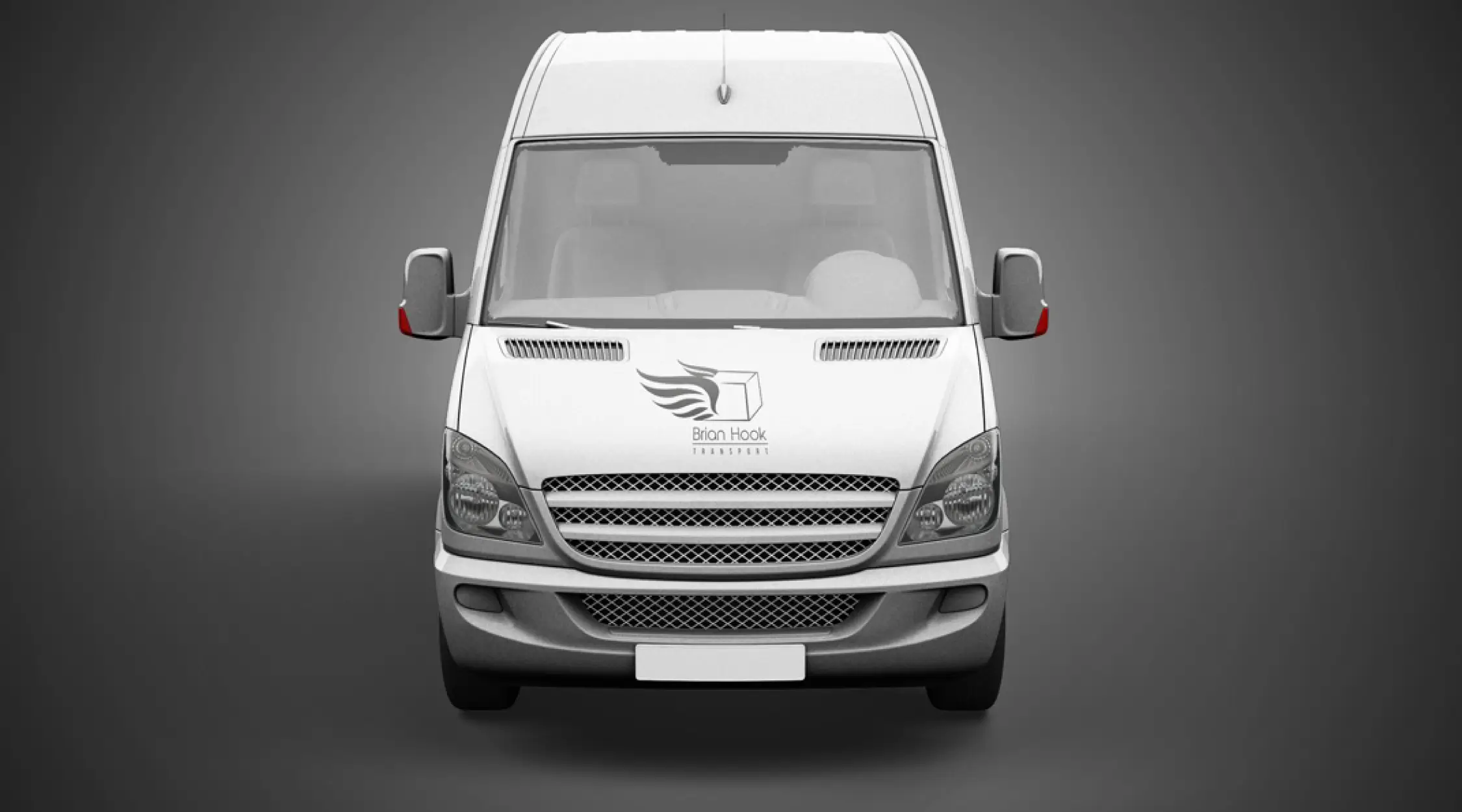
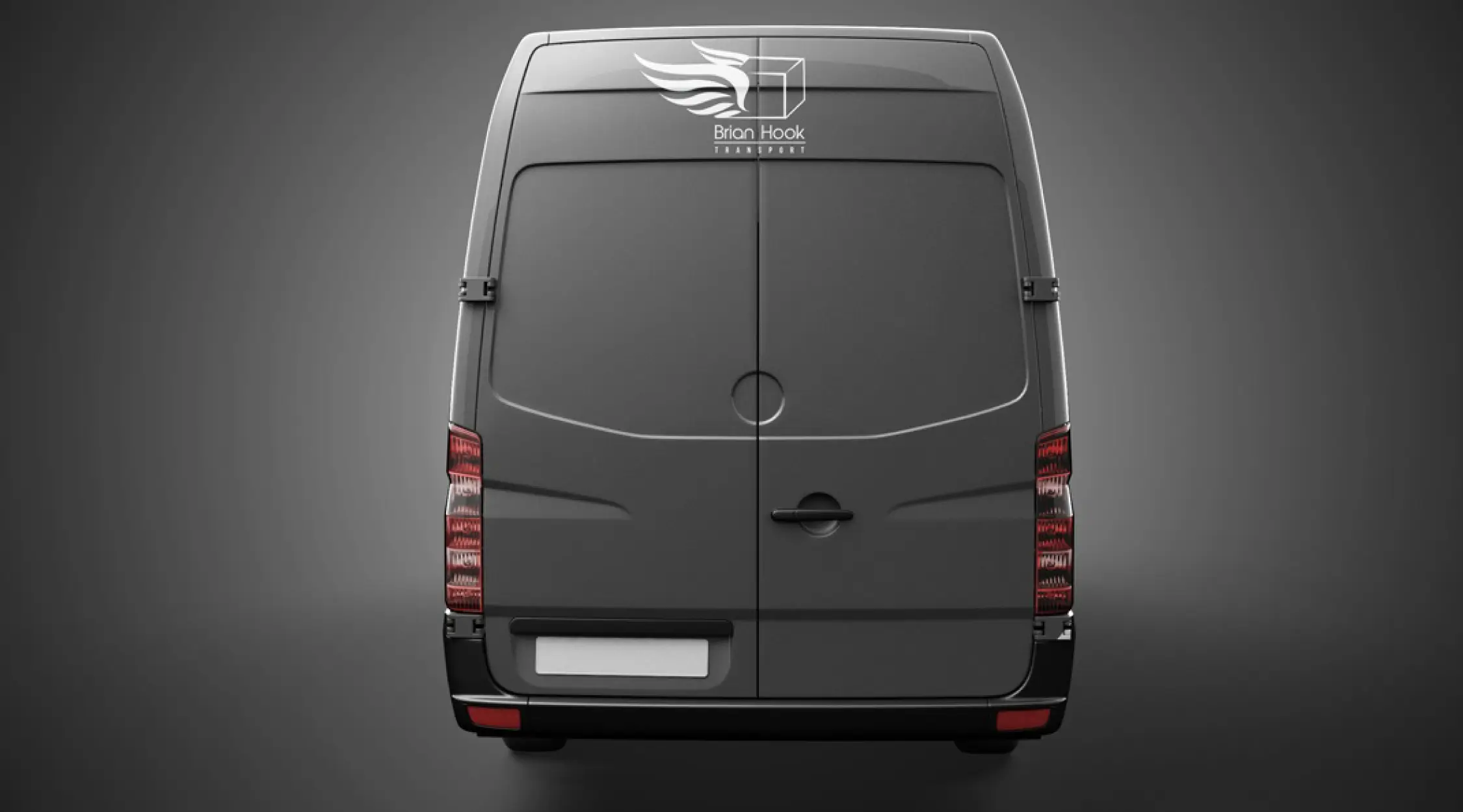
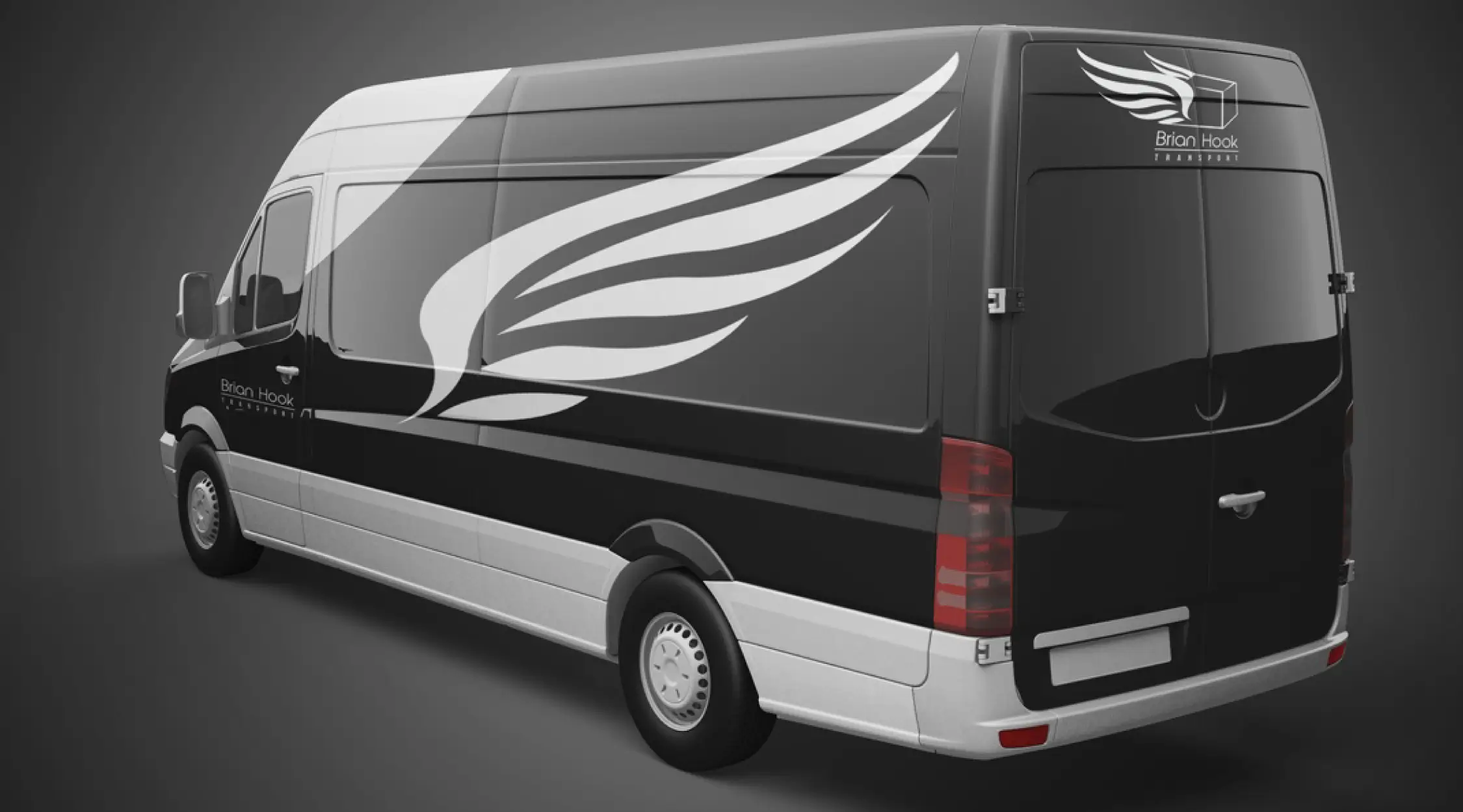
Visual Theme: A dynamic graphic system using contrasting colours, directional elements, and simplified iconography that enhances brand visibility on the move.
Colour Palette: A combination of strong, professional tones paired with high-contrast accents to ensure readability and visual impact at distance.
Vehicle Application Mockups: Full-scale van graphics developed to ensure the visual identity works holistically from fleet visibility to brand recall.
Outcome
The new branding creates a confident and memorable visual presence for Brian Hook Transport. The logo and vehicle graphics system deliver clear brand recognition from near and far, aligning with the company’s values of professionalism, safety, and performance. Whether viewed on the road or in marketing materials, the identity reflects a reliable transport partner with standout visual authority.
Next
Project
brian hook
Logo & Vehicle Branding Campaign

Overview
Brian Hook Transport is a logistics and haulage company seeking a refreshed brand presence that would stand out on the road and in communications. The project involved designing a new logo and overarching visual theme specifically developed to be applied on transport vans, signage, and marketing materials that conveys authority, reliability, and visibility.


Design
Process
Challenge
The transport industry is highly competitive, and visual branding must balance professionalism with memorability. For Brian Hook Transport, the objective was to create a serious, trustworthy identity that also catches the eye at highway speeds and on first impressions especially through its implementation on vehicle livery.
Approach
I focused on designing a visual system that would perform equally well in static formats (print and digital) and dynamic environments (moving vehicles).
Logo Design: A bold logotype with structured letterforms, designed to communicate strength and reliability. The proportions and weight were selected to ensure clarity at large scales perfect for vehicle wraps and signage.
Visual Theme: A dynamic graphic system using contrasting colours, directional elements, and simplified iconography that enhances brand visibility on the move.
Colour Palette: A combination of strong, professional tones paired with high-contrast accents to ensure readability and visual impact at distance.
Vehicle Application Mockups: Full-scale van graphics developed to ensure the visual identity works holistically from fleet visibility to brand recall.
Outcome
The new branding creates a confident and memorable visual presence for Brian Hook Transport. The logo and vehicle graphics system deliver clear brand recognition from near and far, aligning with the company’s values of professionalism, safety, and performance. Whether viewed on the road or in marketing materials, the identity reflects a reliable transport partner with standout visual authority.
Next
Project
brian hook
Logo & Vehicle Branding Campaign

Overview
Brian Hook Transport is a logistics and haulage company seeking a refreshed brand presence that would stand out on the road and in communications. The project involved designing a new logo and overarching visual theme specifically developed to be applied on transport vans, signage, and marketing materials that conveys authority, reliability, and visibility.


Design
Process
Challenge
The transport industry is highly competitive, and visual branding must balance professionalism with memorability. For Brian Hook Transport, the objective was to create a serious, trustworthy identity that also catches the eye at highway speeds and on first impressions especially through its implementation on vehicle livery.
Approach
I focused on designing a visual system that would perform equally well in static formats (print and digital) and dynamic environments (moving vehicles).
Logo Design: A bold logotype with structured letterforms, designed to communicate strength and reliability. The proportions and weight were selected to ensure clarity at large scales perfect for vehicle wraps and signage.
Visual Theme: A dynamic graphic system using contrasting colours, directional elements, and simplified iconography that enhances brand visibility on the move.
Colour Palette: A combination of strong, professional tones paired with high-contrast accents to ensure readability and visual impact at distance.
Vehicle Application Mockups: Full-scale van graphics developed to ensure the visual identity works holistically from fleet visibility to brand recall.
Outcome
The new branding creates a confident and memorable visual presence for Brian Hook Transport. The logo and vehicle graphics system deliver clear brand recognition from near and far, aligning with the company’s values of professionalism, safety, and performance. Whether viewed on the road or in marketing materials, the identity reflects a reliable transport partner with standout visual authority.
Next
Project