Money Wellness App
A mobile-first payments self-service concept designed to simplify complex financial journeys, reduce operational dependency on support teams, and build long-term user confidence.

Overview
Situation
The Challenge
Money Wellness supports people navigating financial difficulty a high-stress, high-stakes context where customers often rely on phone support to understand balances, manage payments, or recover from missed payments.
The challenge was to design a mobile-first self-service payments experience that:
Reduces reliance on call-centre support
Builds confidence in managing payments digitally
Supports vulnerable users without removing access to human help
Simplifies complex financial actions into clear, reassuring flows
Goals & Success Criteria
User Goals
Quickly understand their financial position
Make payments without fear of “doing the wrong thing”
Recover from missed payments without judgement or pressure
Business Goals
Reduce inbound payment-related calls
Increase adoption of digital self-service
Encourage repeat use and long-term confidence in the app
Understanding the User
Money Wellness customers often experience:
Financial stress and anxiety
Low confidence in financial decision-making
Fear of unintended consequences when taking action
With 40% of users flagged as vulnerable, the experience needed to prioritise:
Reassurance over speed
Clarity over density
Guidance over automation
UX Principles
To guide decisions, I anchored the design around four core principles:
Reduce anxiety before reducing friction
Progressive disclosure of complexity
Reassurance at every decision point
Digital self-service with visible safety nets
These principles shaped both the flow structure and the language used throughout the experience.
The Solution
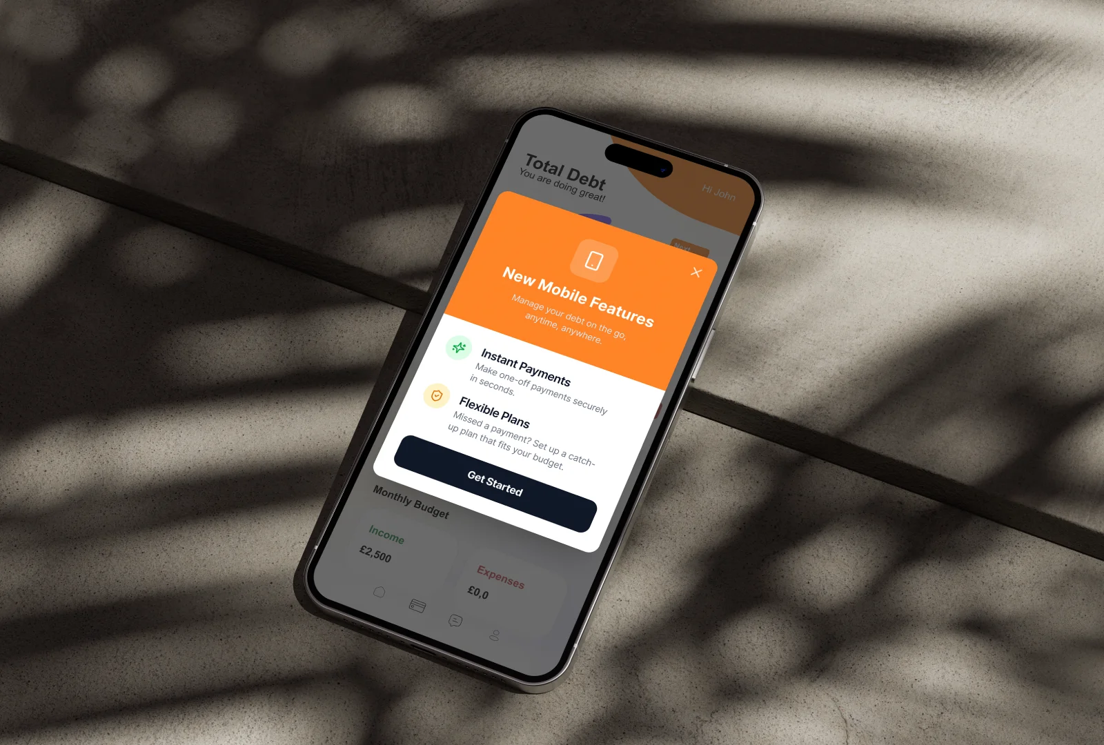
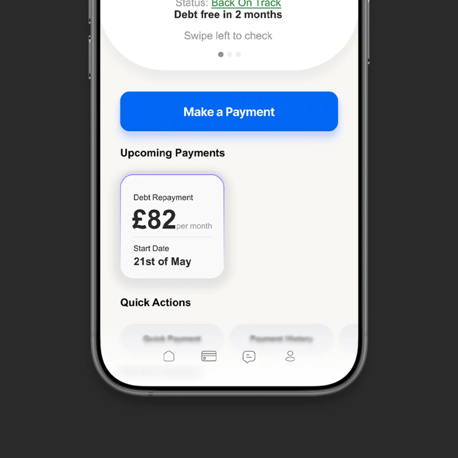
Payments Overview (Anchor Screen)
The experience centres around a clear payments overview that immediately answers the most common call-driver:
“Where do I stand?”
Users can see:
Outstanding balance
Next payment date
Current status (on track / missed payment)
Primary actions adapt contextually, ensuring users are guided toward the most relevant next step.
Design
Process
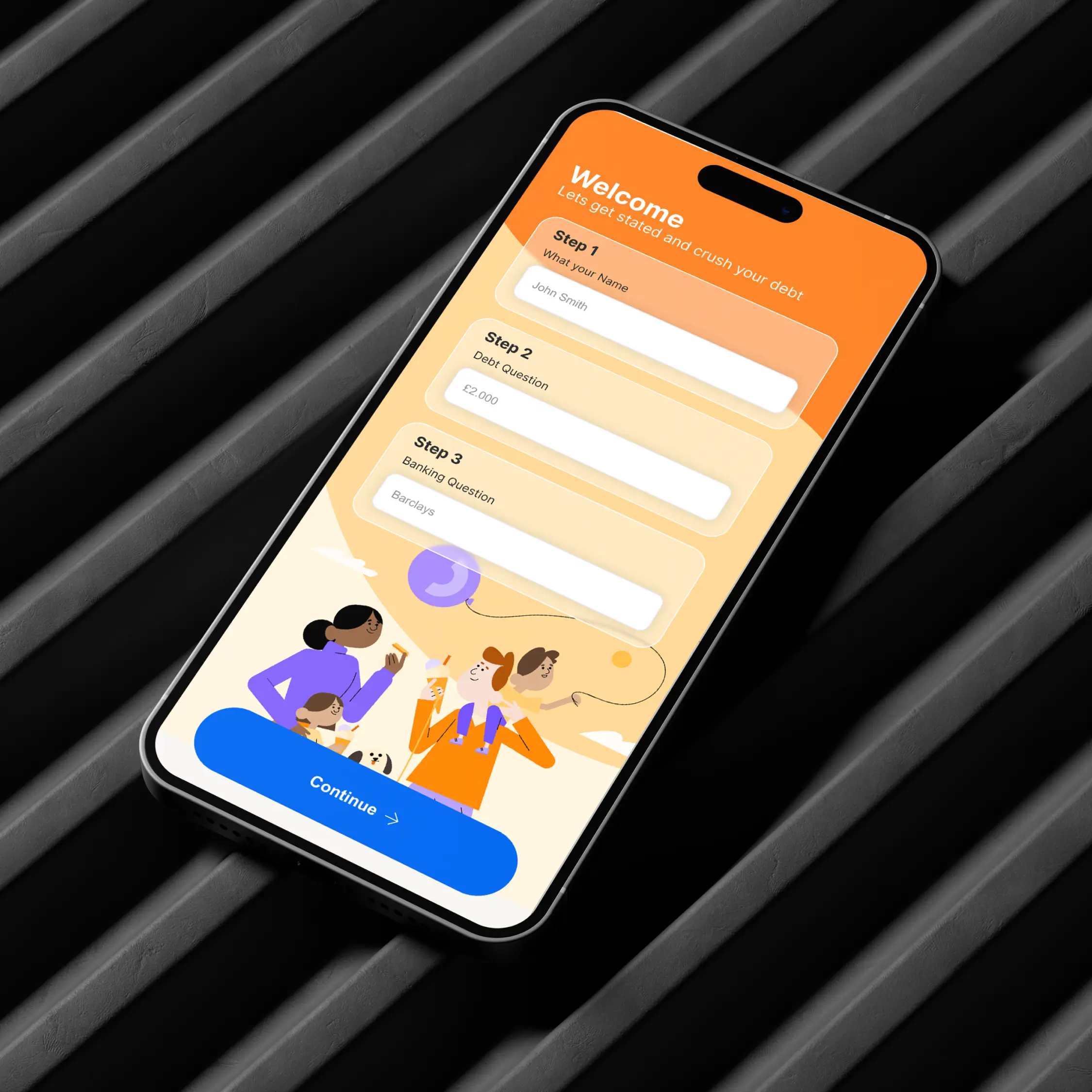
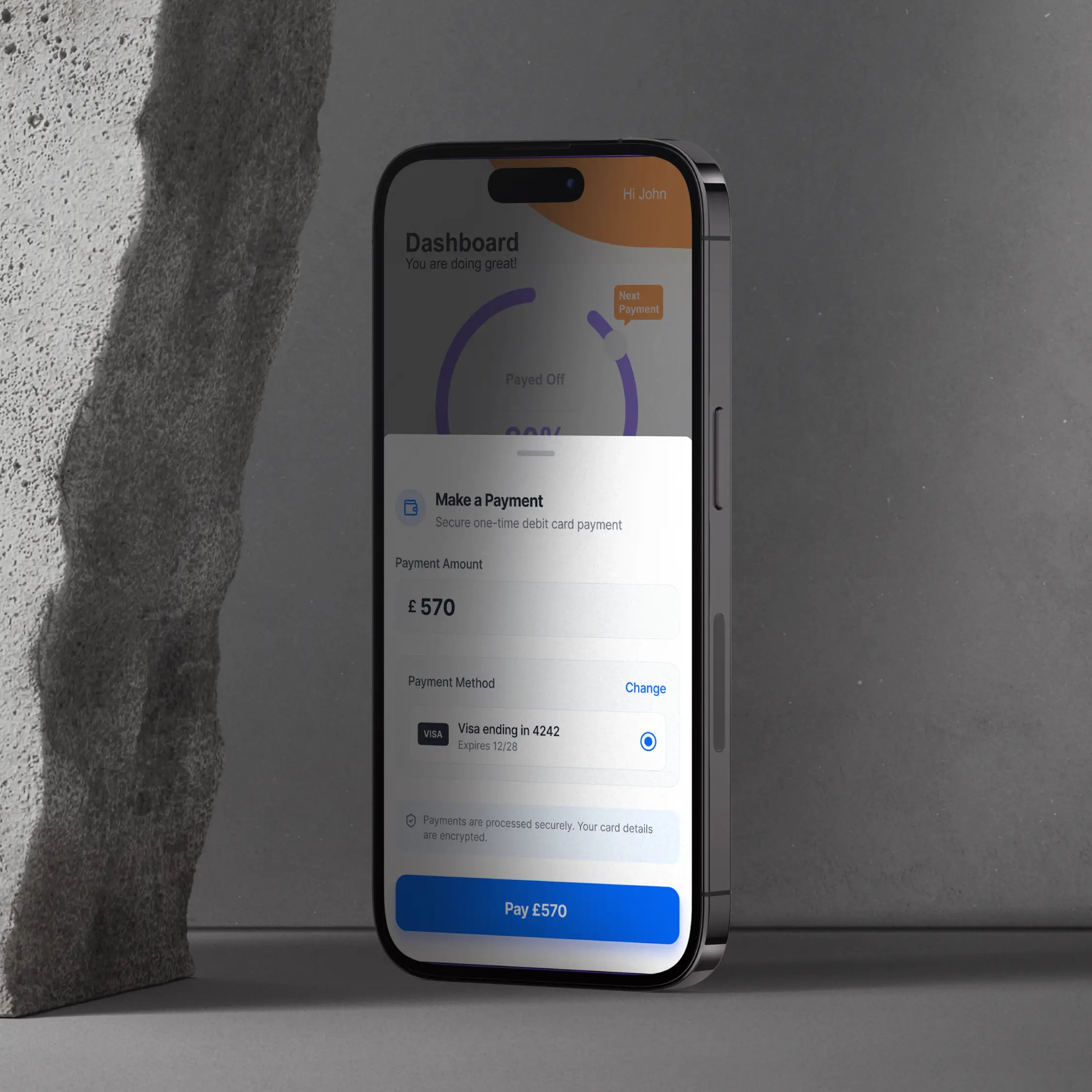
One-Off Payment Flow
For users who want to make an immediate payment:
Pre-filled suggested amounts reduce cognitive load
Clear reassurance explains the impact of the payment
A review step prevents anxiety-driven abandonment
This approach balances speed with confidence, reducing follow-up calls caused by uncertainty after payment.
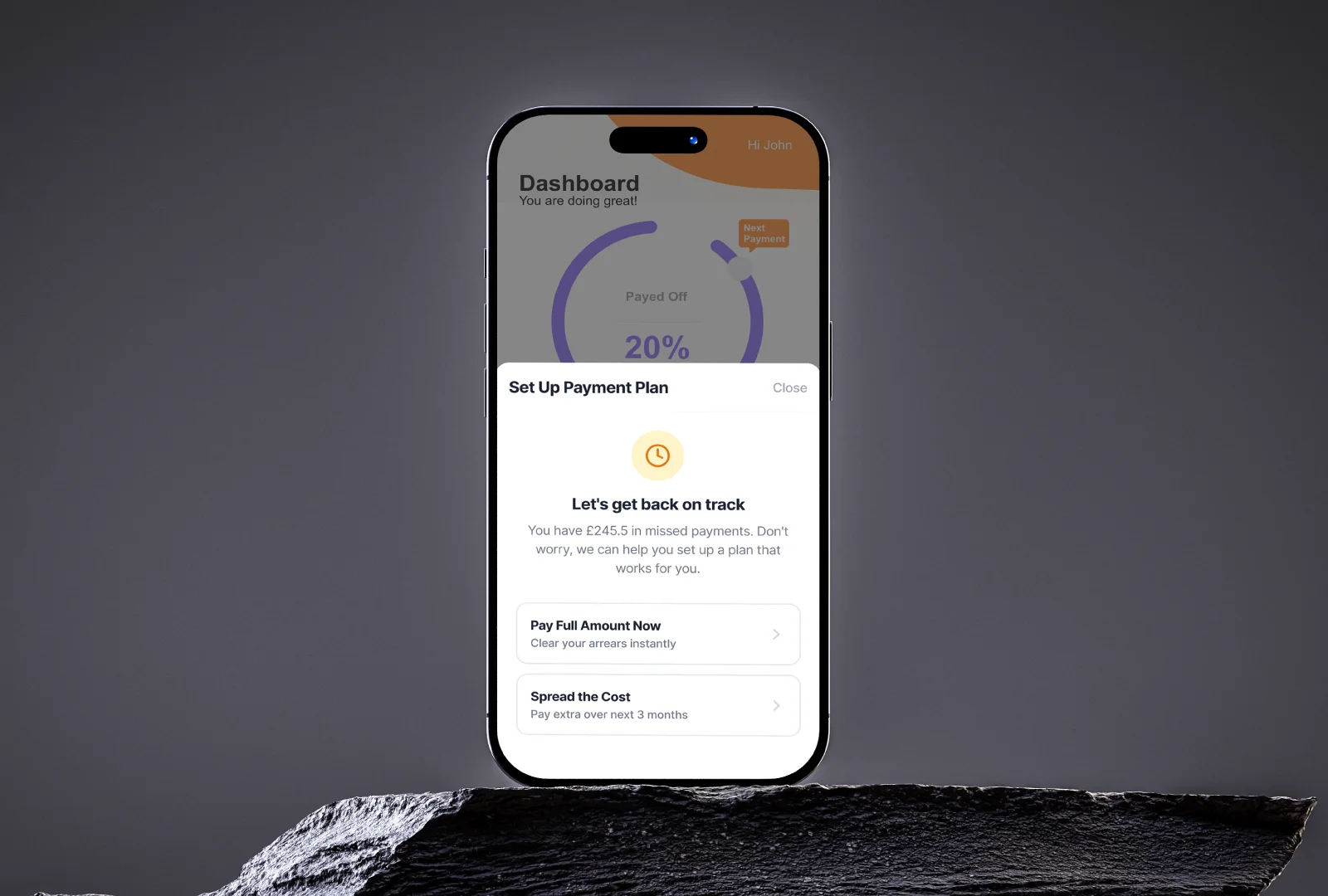
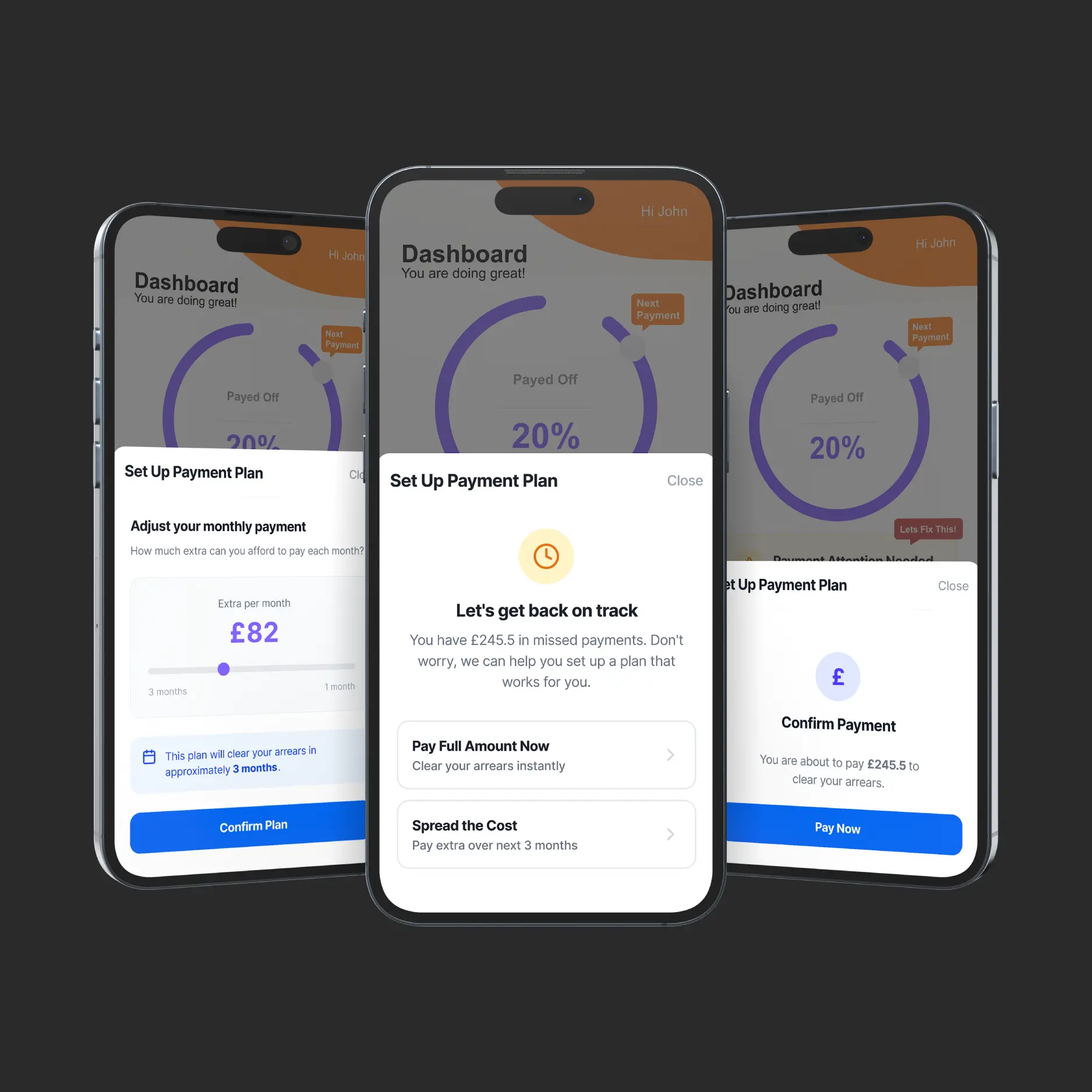
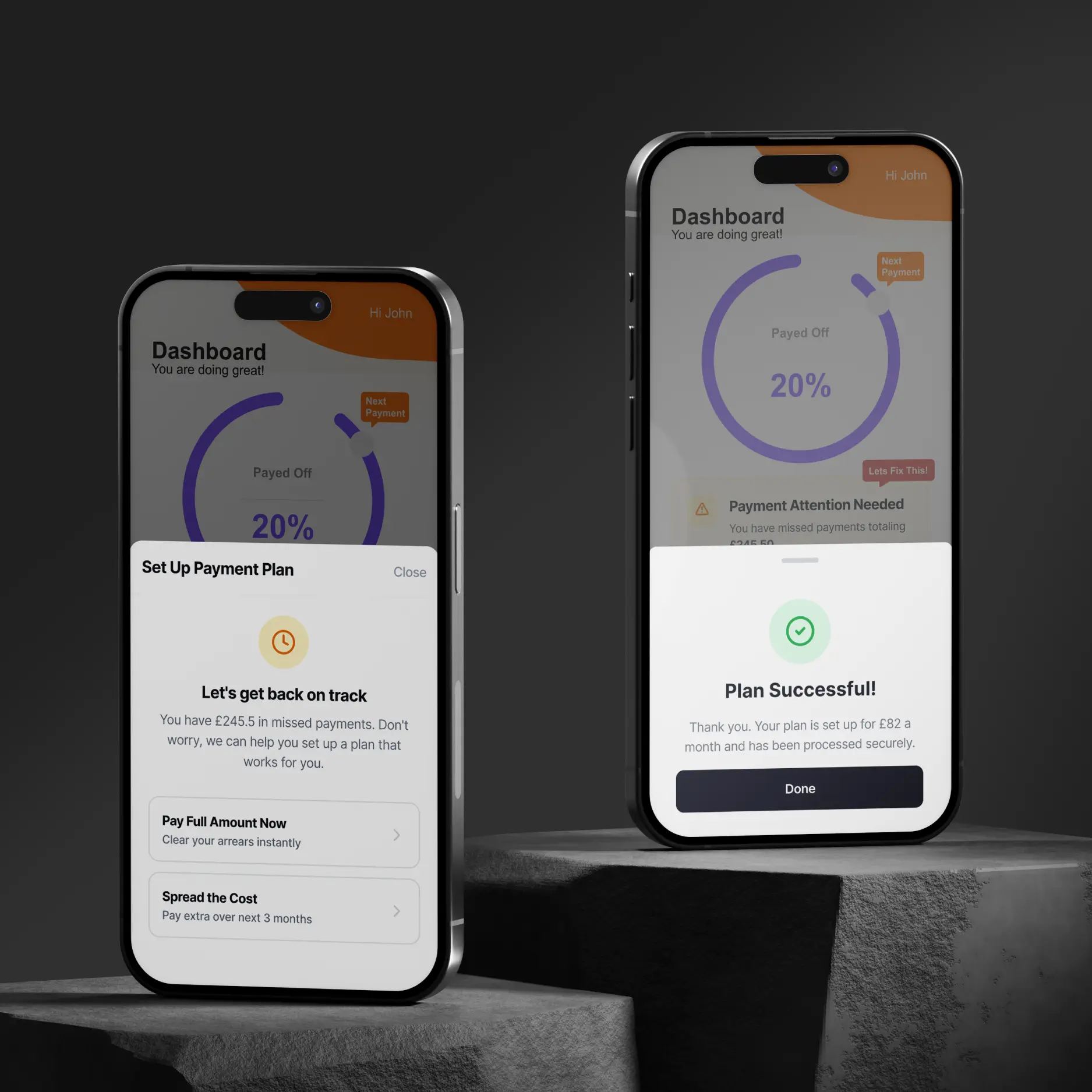
Catch-Up Payment Flow (Missed Payments)
Missed payments trigger a non-judgemental prompt, guiding users toward recovery rather than avoidance.
The catch-up flow:
Explains the option in plain language
Suggests manageable defaults
Allows flexibility without overwhelming choice
Ends with positive reinforcement (“You’re back on track”)
This design reframes missed payments as solvable, reducing shame and encouraging engagement.
Adoption & Confidence Building
To encourage first-time use and repeat engagement, the feature is promoted through:
Contextual in-app prompts
Gentle onboarding language
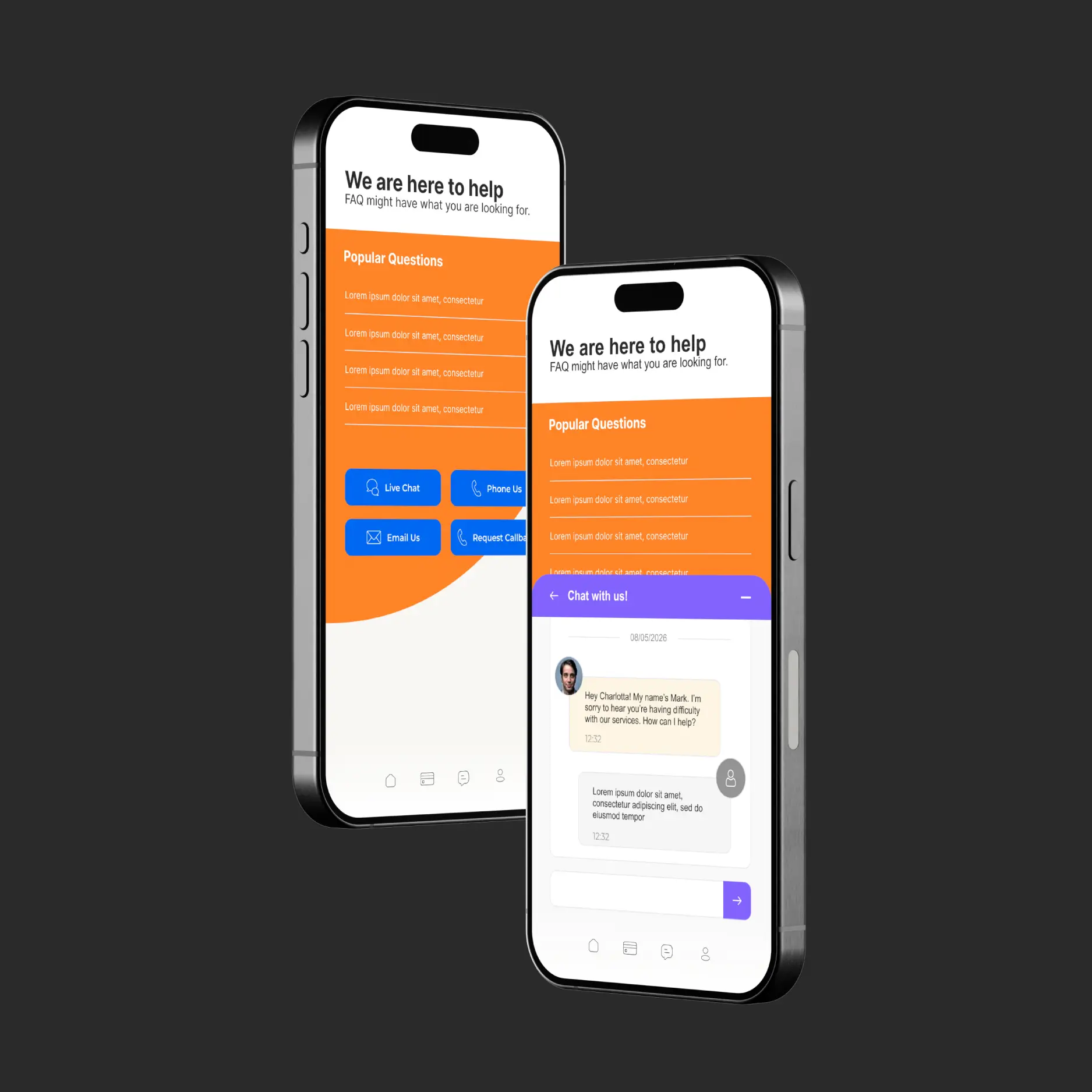
Persistent access to help and human support
Digital self-service is positioned as empowering, not isolating.
Accessibility & Vulnerability Considerations
Calm, neutral language
No urgency, countdowns, or punitive messaging
Clear exit routes to support at every stage
Simple layouts with strong hierarchy
These decisions ensure the experience is usable and supportive for users under stress.
Outcome & Impact (Expected)
While this was a conceptual task, the design is intended to:
Reduce payment-related inbound calls
Increase completion of digital payments
Improve user confidence and trust in the app
Support vulnerable users without increasing operational load
Top 5 UX Wins
Five high-impact UX improvements focused on reducing support dependency, increasing user confidence, and simplifying complex financial journeys through reassurance-led design.

01
Clear Payments Overview That Reduces Call Drivers
Designed a single, confidence-building payments overview that immediately answers the most common user question “Where do I stand?” reducing the need for reassurance-seeking calls and support queries.
Why it matters:
Clarity at the entry point prevents unnecessary escalation to human support and builds trust in digital self-service.
02
Reassurance-Led Payment Flows That Increase Completion
Introduced review steps, plain-English explanations, and explicit reassurance around payment impact to reduce fear of “doing the wrong thing” a key blocker in financially vulnerable contexts.
Why it matters:
Lower anxiety leads to higher completion rates and fewer follow-up calls after digital payments.
03
Non-Judgemental Recovery for Missed Payments
Reframed missed payments as solvable moments rather than failures, using supportive language and guided catch-up plans instead of alerts or penalties.
Why it matters:
Encourages engagement rather than avoidance, particularly for vulnerable users who might otherwise disengage or call for help.
04
Progressive Disclosure of Financial Complexity
Structured the experience to reveal complexity only when needed, using suggested defaults and step-by-step guidance rather than overwhelming users with options upfront.
Why it matters:
Reduces cognitive load, supports decision-making under stress, and improves confidence in managing finances digitally.
05
Self-Service Without Removing Human Support
Designed visible, persistent pathways to help at every stage, ensuring users feel supported even when self-serving increasing adoption without increasing risk.
Why it matters:
Users are more willing to self-serve when they know support is still available, directly reducing call-centre dependency over time.
App
Prototype
This interactive mobile prototype demonstrates a focused end-to-end user journey.
Please note this is a design prototype, not a working site, and some interactions are out of scope.
Want to
see more?
Browse my other projects to explore how I approach UX, UI, and product design across a range of challenges.

End to End UX
TFS App
Led a full end-to-end UX redesign, improving usability, engagement, and repeat app usage from concept through to build.
Money Wellness App
A mobile-first payments self-service concept designed to simplify complex financial journeys, reduce operational dependency on support teams, and build long-term user confidence.
Overview
Situation
The Challenge
Money Wellness supports people navigating financial difficulty a high-stress, high-stakes context where customers often rely on phone support to understand balances, manage payments, or recover from missed payments.
The challenge was to design a mobile-first self-service payments experience that:
Reduces reliance on call-centre support
Builds confidence in managing payments digitally
Supports vulnerable users without removing access to human help
Simplifies complex financial actions into clear, reassuring flows
Goals & Success Criteria
User Goals
Quickly understand their financial position
Make payments without fear of “doing the wrong thing”
Recover from missed payments without judgement or pressure
Business Goals
Reduce inbound payment-related calls
Increase adoption of digital self-service
Encourage repeat use and long-term confidence in the app
Understanding the User
Money Wellness customers often experience:
Financial stress and anxiety
Low confidence in financial decision-making
Fear of unintended consequences when taking action
With 40% of users flagged as vulnerable, the experience needed to prioritise:
Reassurance over speed
Clarity over density
Guidance over automation
UX Principles
To guide decisions, I anchored the design around four core principles:
Reduce anxiety before reducing friction
Progressive disclosure of complexity
Reassurance at every decision point
Digital self-service with visible safety nets
These principles shaped both the flow structure and the language used throughout the experience.
The Solution
Payments Overview (Anchor Screen)
The experience centres around a clear payments overview that immediately answers the most common call-driver:
“Where do I stand?”
Users can see:
Outstanding balance
Next payment date
Current status (on track / missed payment)
Primary actions adapt contextually, ensuring users are guided toward the most relevant next step.
Design
Process
One-Off Payment Flow
For users who want to make an immediate payment:
Pre-filled suggested amounts reduce cognitive load
Clear reassurance explains the impact of the payment
A review step prevents anxiety-driven abandonment
This approach balances speed with confidence, reducing follow-up calls caused by uncertainty after payment.
Catch-Up Payment Flow (Missed Payments)
Missed payments trigger a non-judgemental prompt, guiding users toward recovery rather than avoidance.
The catch-up flow:
Explains the option in plain language
Suggests manageable defaults
Allows flexibility without overwhelming choice
Ends with positive reinforcement (“You’re back on track”)
This design reframes missed payments as solvable, reducing shame and encouraging engagement.
Adoption & Confidence Building
To encourage first-time use and repeat engagement, the feature is promoted through:
Contextual in-app prompts
Gentle onboarding language
Persistent access to help and human support
Digital self-service is positioned as empowering, not isolating.
Accessibility & Vulnerability Considerations
Calm, neutral language
No urgency, countdowns, or punitive messaging
Clear exit routes to support at every stage
Simple layouts with strong hierarchy
These decisions ensure the experience is usable and supportive for users under stress.
Outcome & Impact (Expected)
While this was a conceptual task, the design is intended to:
Reduce payment-related inbound calls
Increase completion of digital payments
Improve user confidence and trust in the app
Support vulnerable users without increasing operational load
Top 5 UX Wins
Five high-impact UX improvements focused on reducing support dependency, increasing user confidence, and simplifying complex financial journeys through reassurance-led design.
01
Clear Payments Overview That Reduces Call Drivers
Designed a single, confidence-building payments overview that immediately answers the most common user question “Where do I stand?” reducing the need for reassurance-seeking calls and support queries.
Why it matters:
Clarity at the entry point prevents unnecessary escalation to human support and builds trust in digital self-service.
02
Reassurance-Led Payment Flows That Increase Completion
Introduced review steps, plain-English explanations, and explicit reassurance around payment impact to reduce fear of “doing the wrong thing” a key blocker in financially vulnerable contexts.
Why it matters:
Lower anxiety leads to higher completion rates and fewer follow-up calls after digital payments.
03
Non-Judgemental Recovery for Missed Payments
Reframed missed payments as solvable moments rather than failures, using supportive language and guided catch-up plans instead of alerts or penalties.
Why it matters:
Encourages engagement rather than avoidance, particularly for vulnerable users who might otherwise disengage or call for help.
04
Progressive Disclosure of Financial Complexity
Structured the experience to reveal complexity only when needed, using suggested defaults and step-by-step guidance rather than overwhelming users with options upfront.
Why it matters:
Reduces cognitive load, supports decision-making under stress, and improves confidence in managing finances digitally.
05
Self-Service Without Removing Human Support
Designed visible, persistent pathways to help at every stage, ensuring users feel supported even when self-serving increasing adoption without increasing risk.
Why it matters:
Users are more willing to self-serve when they know support is still available, directly reducing call-centre dependency over time.
App
Prototype
This interactive mobile prototype demonstrates a focused end-to-end user journey.
Please note this is a design prototype, not a working site, and some interactions are out of scope.
Want to
see more?
Browse my other projects to explore how I approach UX, UI, and product design across a range of challenges.
End to End UX
TFS App
Led a full end-to-end UX redesign, improving usability, engagement, and repeat app usage from concept through to build.