Kellys Irish Bar
Brand Identity & Visual Refresh

Overview
Kelly’s Irish Bar was undergoing a full revamp and needed a refreshed brand identity that honoured its heritage while signalling a more contemporary vibe. The goal was to create a visual system that felt authentic to the spirit of a traditional Irish pub, but with a modern edge that would appeal to new customers and elevate the bar’s presence both on-site and in digital spaces.
Design
Prosess
Challenge
The bar’s old signage and branding relied heavily on dated visual elements that didn’t reflect the quality of the experience the owner wanted to create. The challenge was to strike a balance between nostalgic charm and modern refinement maintaining the bar’s personality while making it feel relevant today.
Approach
To tackle this, I explored the core essence of traditional Irish bar aesthetics particularly the hand-painted sign lettering, wood textures, and warm colour palettes and identified key visual cues that could be evolved rather than replaced. I blended these with cleaner type treatments, simplified iconography, and contemporary layout principles to create a cohesive identity that feels both classic and fresh.
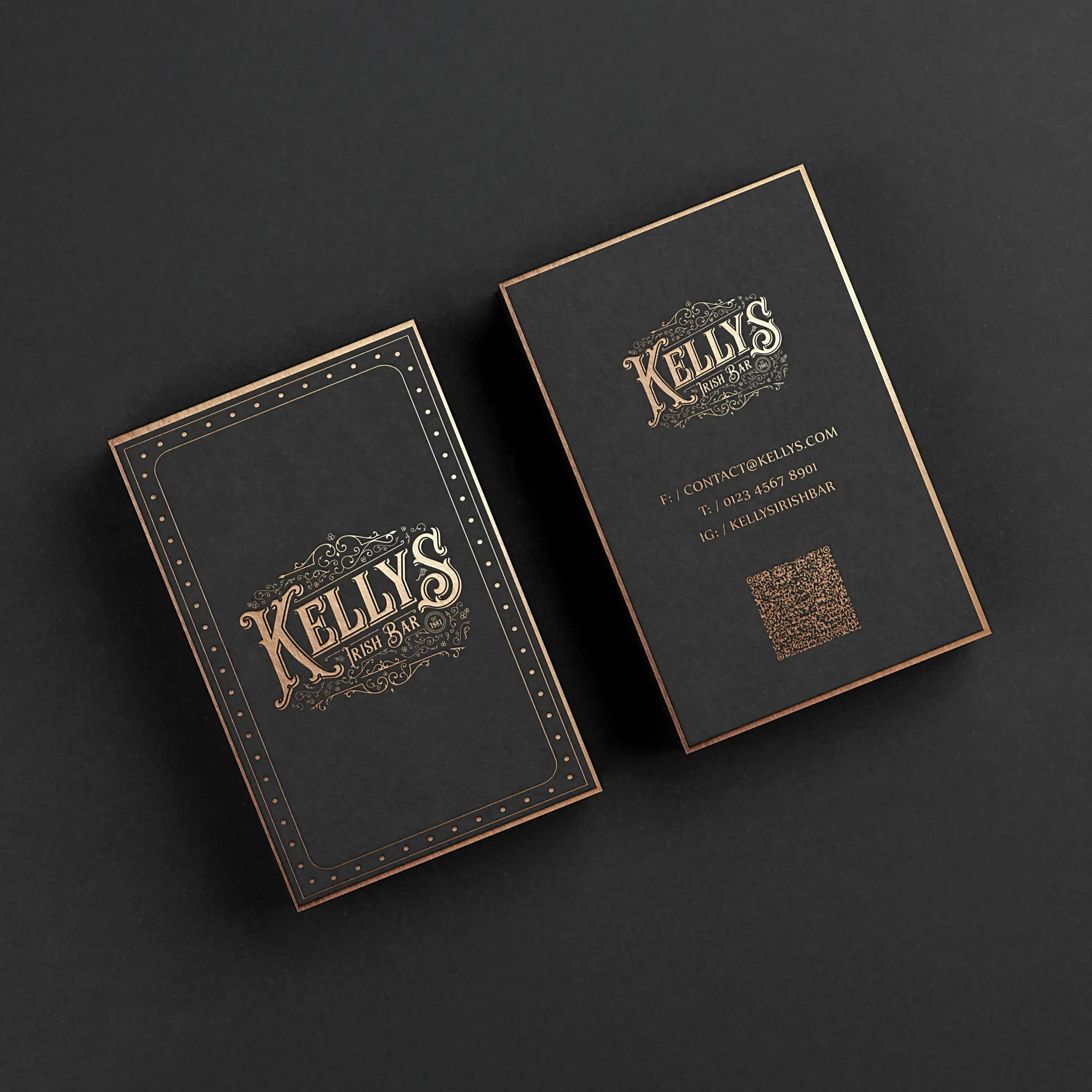
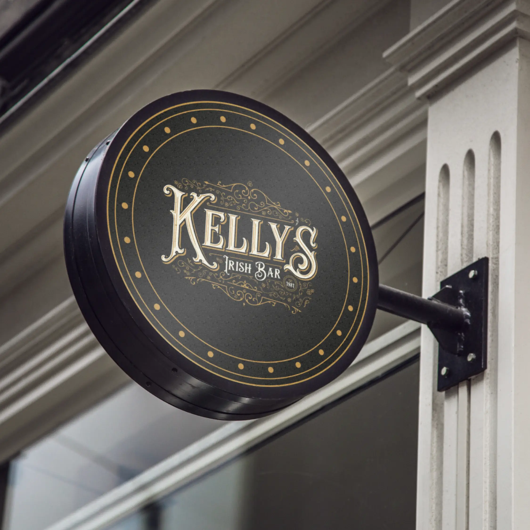
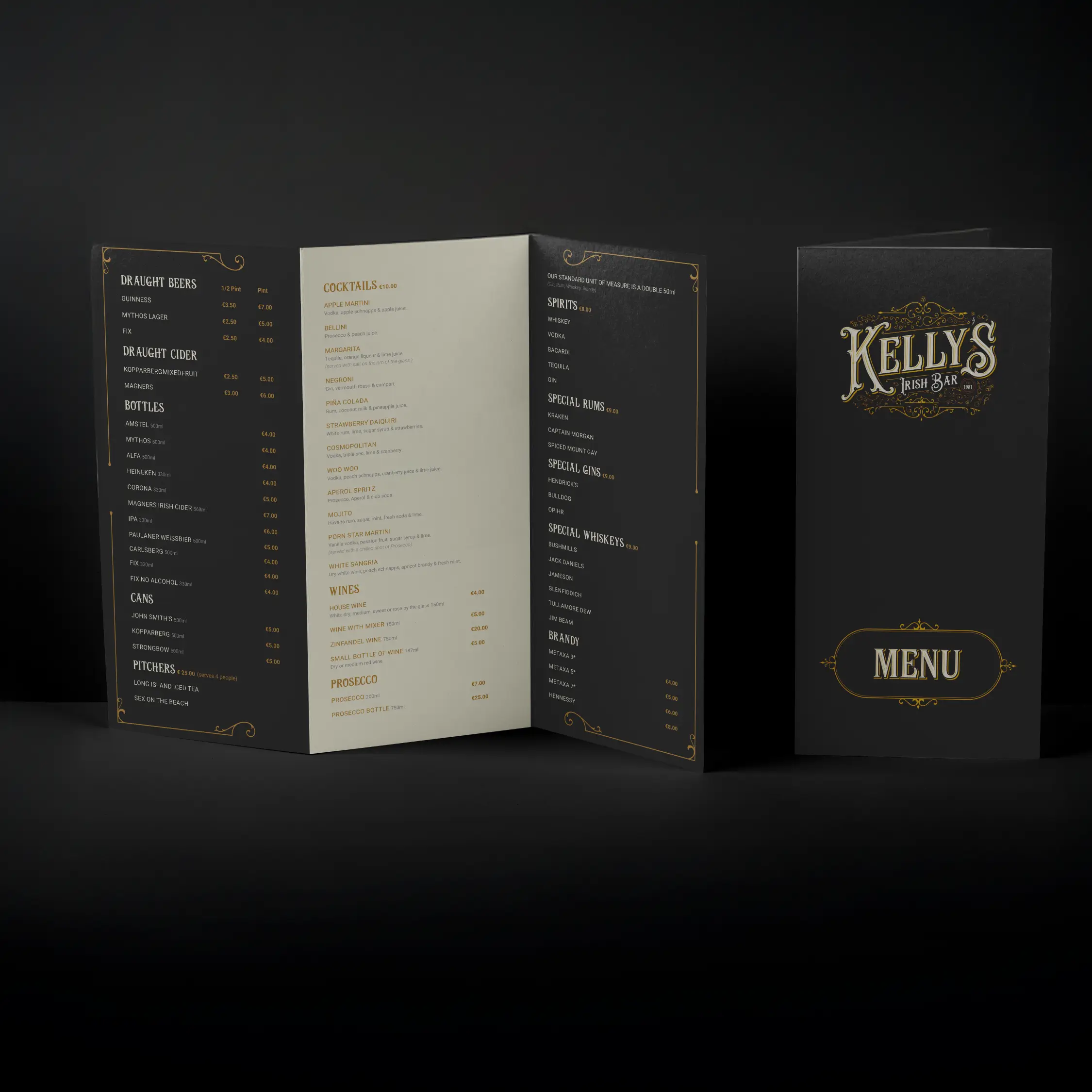
Typography & Lettering: Custom hand-drawn logotype inspired by traditional pub signage, paired with a modern serif for supporting text to add readability and contrast.
Colour Palette: Warm greens, amber, and charcoal tones to evoke both Irish roots and a comfortable, welcoming atmosphere.
Graphic Elements: Handcrafted icons and badges reflecting pub culture, adapted into a modular system for menus, signage, and social media.
Outcome
The new identity resonates with both locals and visitors, giving Kelly’s a visual voice that stands out in a crowded market. The system works flexibly across physical signage, printed menus, and digital assets preserving the bar’s heritage while modernising the overall impression.
Next
Project
Kellys Irish Bar
Brand Identity & Visual Refresh
Overview
Kelly’s Irish Bar was undergoing a full revamp and needed a refreshed brand identity that honoured its heritage while signalling a more contemporary vibe. The goal was to create a visual system that felt authentic to the spirit of a traditional Irish pub, but with a modern edge that would appeal to new customers and elevate the bar’s presence both on-site and in digital spaces.
Design
Prosess
Challenge
The bar’s old signage and branding relied heavily on dated visual elements that didn’t reflect the quality of the experience the owner wanted to create. The challenge was to strike a balance between nostalgic charm and modern refinement maintaining the bar’s personality while making it feel relevant today.
Approach
To tackle this, I explored the core essence of traditional Irish bar aesthetics particularly the hand-painted sign lettering, wood textures, and warm colour palettes and identified key visual cues that could be evolved rather than replaced. I blended these with cleaner type treatments, simplified iconography, and contemporary layout principles to create a cohesive identity that feels both classic and fresh.
Typography & Lettering: Custom hand-drawn logotype inspired by traditional pub signage, paired with a modern serif for supporting text to add readability and contrast.
Colour Palette: Warm greens, amber, and charcoal tones to evoke both Irish roots and a comfortable, welcoming atmosphere.
Graphic Elements: Handcrafted icons and badges reflecting pub culture, adapted into a modular system for menus, signage, and social media.
Outcome
The new identity resonates with both locals and visitors, giving Kelly’s a visual voice that stands out in a crowded market. The system works flexibly across physical signage, printed menus, and digital assets preserving the bar’s heritage while modernising the overall impression.
Next
Project